Livelo Viagens: redesigning the travel booking experience with price transparency and intuitive navigation.
Overview
Livelo is one of Brazil’s largest loyalty programs, allowing members to accumulate and redeem points across multiple categories.
This project focused on the travel vertical, Livelo Viagens, where users can book flights, hotels, and travel packages using points.
Role: Senior Product Designer
Period: 2023 to 2025
Scope: End-to-end redesign of the travel booking experience within the Livelo ecosystem
Note: The UI examples shown here are illustrative and represent earlier exploration stages. The current production version has evolved further. Screens are adapted to preserve confidentiality while demonstrating structural decisions.
The context
Booking travel with loyalty points introduces a layer of complexity beyond standard e-commerce.
Users must:
- Understand how many points they have
- Evaluate the value of points versus currency
- Compare prices
- Navigate partner integrations
- Complete bookings with multiple mandatory inputs
At the same time, the business must:
- Apply complex pricing tiers
- Respect partner rules
- Maintain margin
- Surface promotional opportunities
Booking here is a negotiation between perceived value and business logic.
The problem
The existing experience had three main issues:
- Navigation was not intuitive. Users struggled to find what they needed and understand where they were in the journey.
- Price transparency was poor. Users could not quickly understand how many points were required and how values were calculated.
- Input complexity created friction. Business-required fields and conditional logic made the booking flow heavy and cognitively demanding.
The result was hesitation during decision-making and unnecessary drop-offs.
Research and benchmarking
Before redesigning the flow, I conducted:
- Competitive benchmarking across travel and loyalty platforms
- User interviews with Livelo members
- Heuristic analysis of the existing journey
Key insights
- Users evaluate value before committing to search depth
- Points feel abstract; transparency increases trust
- Overloaded input steps reduce completion confidence
- Users want progressive clarity, not all information at once
This shaped the redesign strategy.
1. Rebuilding the control flow
Structural redesign
Core changes:
- Clearer step progression
- Improved visibility of where the user is in the journey.
- Logical grouping of decisions
- Reduced perceived complexity per screen
- Better separation between search, selection, and confirmation stages
Instead of overwhelming users with layered inputs, the experience became more sequential and intentional.
The business rules stayed. The work was in orchestrating them.
2. Enhancing price transparency
Designing for value clarity
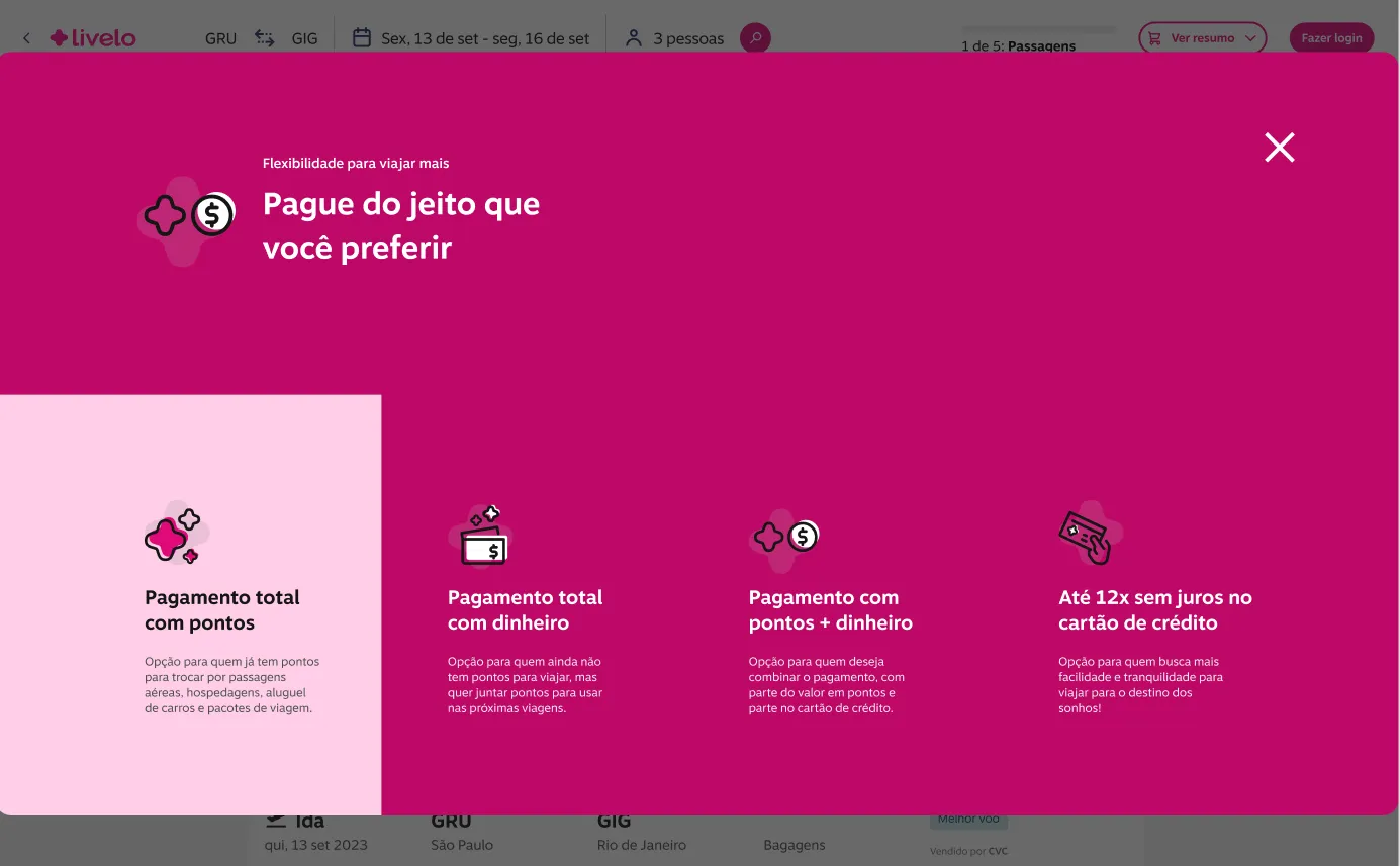
One of the most critical redesign pillars was transparency. In loyalty ecosystems, trust is directly linked to perceived fairness of value exchange.
Users were asking:
- Why does this flight cost this amount in points?
- Is this a good deal?
- How does this compare to currency?
Improvements introduced:
- Clearer display of points required
- Improved visual hierarchy between primary and secondary prices
- Structured breakdown of pricing components
- Reduced ambiguity in promotional logic
The objective was to reduce mental calculation effort. When users understand value quickly, decision confidence increases.
3. Managing complex input layers
Progressive disclosure strategy
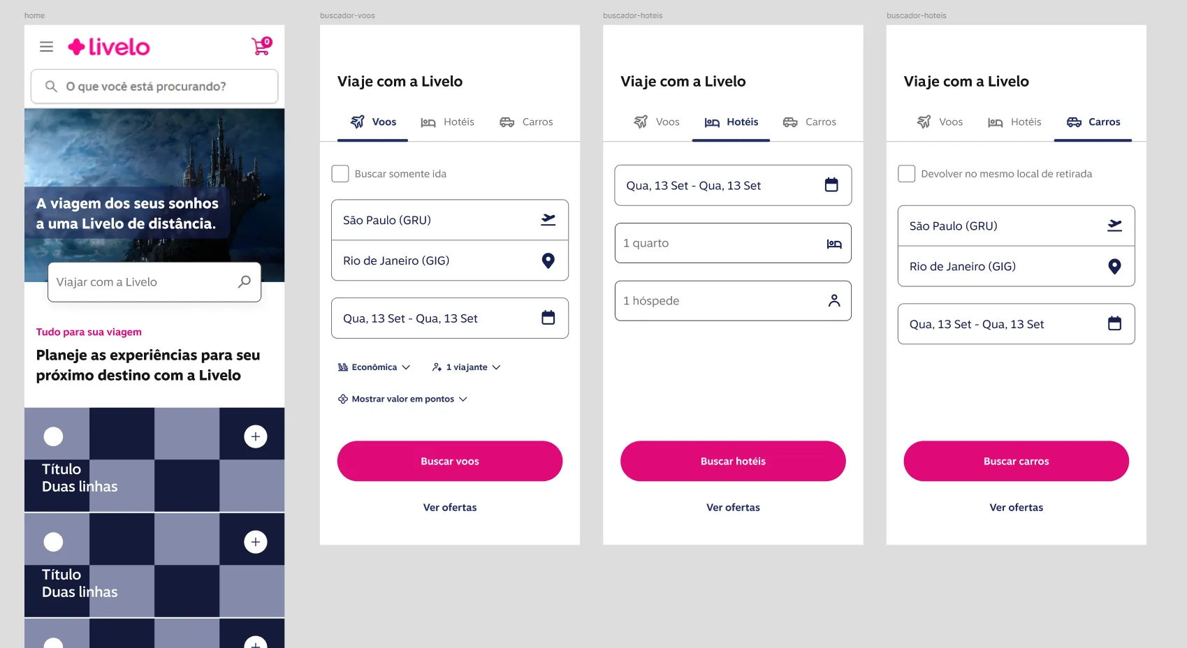
Travel booking naturally requires multiple inputs:
- Passenger data
- Partner requirements
- Payment and confirmation details
- Conditional logic depending on route or partner
The previous flow exposed too much complexity too early.
Strategy applied:
- Progressive disclosure of required inputs
- Contextual explanation when business logic demanded additional information
- Reduction of redundant fields
- Clear validation patterns
- Consistent interaction behavior across web and responsive
The experience became lighter without sacrificing compliance.
Constraints
This project operated under significant constraints:
- Complex partner integrations
- Dynamic pricing rules
- Tiered point redemption systems
- Margin-sensitive business logic
- Continuous product evolution
Every UX decision had direct commercial implications.
Additionally, because this vertical is strategically sensitive, some UI examples shown here are adapted representations of earlier stages. The real impact lies in the structural redesign.
Outcome
The redesign delivered:
- A more intuitive booking control flow
- Improved price transparency
- Reduced friction from complex input layers
- Stronger alignment between user mental models and business logic
The project is ongoing, with continuous optimization cycles based on behavioral data and iteration.
This reflects the reality of marketplace and loyalty ecosystems, which are living systems rather than static products.
My role
Senior Product Designer, 2023 to 2025
Responsibilities:
- UX strategy definition
- Research synthesis
- Benchmark analysis
- End-to-end flow redesign
- Stakeholder alignment
- Balancing business rules with usability
This project demonstrates my ability to lead complex redesigns in ecosystem-driven platforms where business logic and user experience are deeply intertwined.
Results
- Up to 15%
- more completed bookings
- 10 to 30
- participants in interviews and usability tests