Work About World Contact
Product Design · Strategy · Systems

Designing product logic
for complex systems.
Not decorating interfaces.
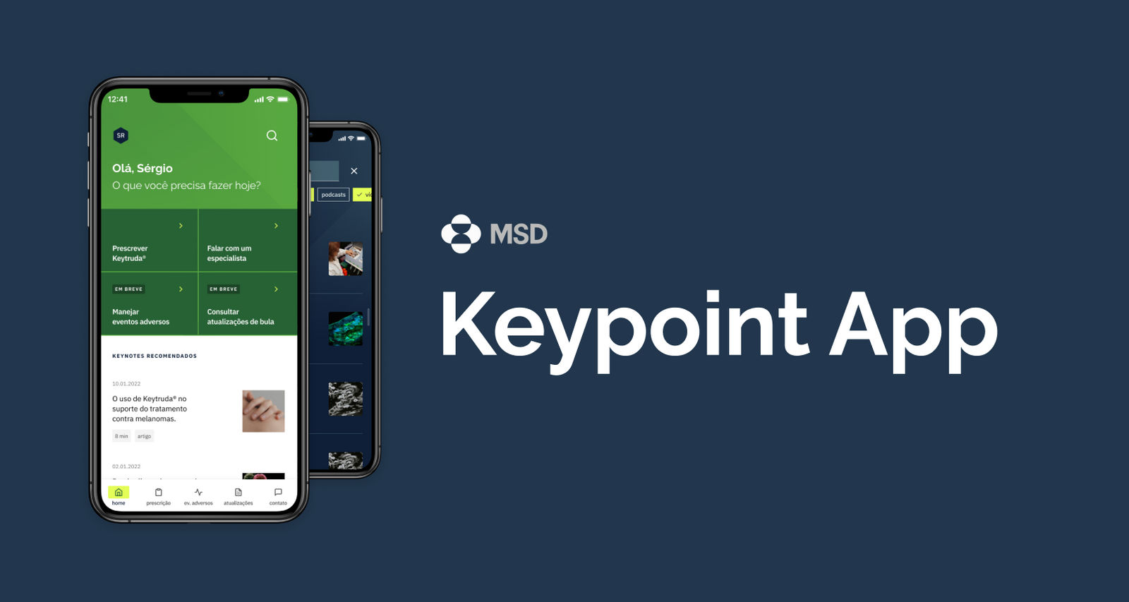
MSD

Healthcare · B2B · Regulated
42%

Itau Rede

Fintech · B2B · Enterprise
67%

Livelo

Travel · B2C · Loyalty
Viagens
Structure before surface.
Good systems don't need decoration. If the architecture is right, the interface becomes self-evident.
Constraints are inputs.
Regulation, technical debt, and business pressure are not obstacles. They are design materials.
Evidence over intuition.
Every decision has a reason. Every reason has data. Intuition generates hypotheses, not product decisions.
Products are systems.
Screens are symptoms. The underlying logic, flows, and decision trees are the actual product.
Back to work
CompanyMSD (Merck Sharp & Dohme)
RoleProduct Designer Senior
DateDecember 2021
TypeMobile App

Keytruda — Guiding physicians through treatment decisions with clarity and precision.

HealthcareB2BMobileRegulated
MSD Keytruda app hero — mobile screens showing the Keytruda physician guide
Overview

Keypoint

Keypoint is a mobile application developed for MSD, focused on supporting physicians who prescribe Keytruda, an immunotherapy treatment widely used in oncology.

As a Senior Product Designer, I was responsible for the end-to-end design of the application, from structure definition to final interface delivery.

The goal was simple in theory but critical in practice: give physicians fast, reliable access to essential drug information during patient consultations.

In healthcare, clarity is not aesthetic. It is safety.

The Context

Keytruda is a complex immunotherapy drug with detailed administration protocols, contraindications, adverse reactions, and interaction risks.

Physicians needed to access:

  • Dosage information
  • Administration guidelines
  • Adverse effects
  • Drug interactions
  • Contraindications

Existing materials were fragmented across PDFs, printed materials, and internal systems. None were optimized for quick mobile access during live consultations.

The opportunity was to transform static regulatory content into an intuitive clinical tool.

The Problem

Oncologists operate under time pressure. During consultations, they cannot navigate dense documents or poorly structured systems.

The core challenge: How might we structure complex pharmaceutical information into a fast, scannable, mobile-first experience without compromising regulatory integrity?

The solution had to balance:

  • Medical precision
  • Brand presence
  • Regulatory compliance
  • Speed of access
  • Cognitive clarity
Defining the Structure

Instead of mirroring internal documentation categories, the navigation was organized around physician questions:

  • What is the correct dosage?
  • How should it be administered?
  • What are the risks?
  • Are there contraindications?
  • Are there drug interactions?

This shift reduced cognitive load and aligned navigation with real consultation scenarios.

Designing for Time Pressure

Key Principles Applied

  • Hierarchical Clarity: Clear typography contrast, structured spacing, and modular sections allow physicians to scan content in seconds.
  • Progressive Disclosure: Information layers were structured to show only what is necessary first, with deeper levels available when needed.
  • Brand Without Noise: MSD brand presence was maintained through color and visual identity, but medical readability always took priority.

The interface needed to feel trustworthy, not promotional.

Transforming Dense Medical Content

Simplification Through Structure

Pharmaceutical content is inherently dense and legally sensitive. Simplification could not mean omission.

To address this:

  • Complex tables were reformatted for mobile readability
  • Critical warnings were visually distinguished
  • Sections were segmented into scannable blocks
  • Terminology remained intact to preserve clinical accuracy

The goal was not simplification of content, but simplification of access.

Interaction and Usability

Micro-UX Decisions

  • Large tap targets for fast interaction
  • Expandable content blocks to reduce scrolling fatigue
  • Clear back navigation to avoid losing context
  • Logical grouping to prevent information overload

Every interaction was designed assuming the physician is multitasking.

Visual Consistency and System Thinking

Scalable Design System

Although delivered as a single product, the application was structured as a scalable system:

  • Reusable components
  • Consistent layout logic
  • Modular content sections
  • Standardized visual indicators for warnings and critical information

This ensures the product can evolve as drug information updates over time.

In pharmaceutical environments, change is constant. The design had to support that reality.

Constraints and Trade-offs

This project required balancing:

  • Strict pharmaceutical regulatory requirements
  • Brand compliance from MSD
  • Clinical precision
  • Mobile usability

Not all ideal UX simplifications were possible due to compliance. Instead, the solution focused on clarity through structure and hierarchy rather than content reduction.

Outcome

The final product delivered a centralized mobile experience covering:

  • Dosage
  • Administration
  • Adverse effects
  • Drug interactions
  • Contraindications

The application transformed static documentation into a consultation-ready clinical tool.

More importantly, it demonstrated how UX can operate in highly regulated environments without losing usability quality.

My Role

Senior Product Designer

End-to-end responsibility:

  • Information architecture
  • UX strategy
  • Interaction design
  • Visual design
  • Final delivery

This project strengthened my ability to design in complex, regulated industries where clarity directly impacts real-world outcomes.

Back to work
CompanyItaú Rede
RoleSenior Product Designer
DateJanuary 2022
TypeWeb / Responsive Design

Optimizing self-service contracting flows and the merchant product ecosystem.

FintechB2BEnterpriseResponsive
Itaú Rede — homepage and contracting flow overview
Overview

Itaú Rede

Itaú Rede is one of Brazil's largest payment processing companies, owned by Itaú Unibanco.

The platform serves millions of business clients, from small entrepreneurs to large corporate accounts.

As a Senior Product Designer, I worked across three strategic fronts:

  1. Optimizing self-service product contracting flows
  2. Improving the Itaú PJ product portfolio structure and usability
  3. Managing and redesigning the public Rede homepage with a stronger content strategy

This project required balancing user experience, legal compliance, business strategy, and multiple stakeholder interests.

The Context

Financial platforms operate in a high-stakes environment:

  • Strict regulatory requirements
  • Legal approval processes
  • Multiple internal stakeholders
  • High user volume
  • Revenue impact tied directly to digital flows

Any friction in contracting flows affects conversion. Any compliance issue creates legal risk. Any confusion in the portfolio structure affects cross-sell and user trust.

This was not a cosmetic redesign. It was structural work.

1. Optimizing Self-Service Contracting Flows

The Problem

The existing self-service contracting journeys had accumulated complexity over time. Users needed to contract financial products quickly and safely.

Flow Restructuring and Step Optimization

Key Design Actions:

  • Reduced cognitive overload per step
  • Improved information hierarchy
  • Clarified legal terms without removing mandatory content
  • Organized inputs logically to reduce errors
  • Made progress visibility clearer

In financial environments, compliance content cannot be removed. The solution was restructuring, not simplification.

I worked closely with legal and business stakeholders to ensure that usability improvements did not compromise regulatory integrity.

Impact

The optimized flows improved efficiency in product contracting, increased clarity around legal obligations, reduced friction in self-service journeys, and strengthened trust in digital contracting.

2. Restructuring the Itaú PJ Product Portfolio

The Problem

The Itaú PJ portfolio had usability issues identified through corporate client pain points.

Challenges included:

  • Confusing categorization
  • Overlapping product descriptions
  • Difficulty comparing offerings
  • Weak hierarchy between primary and secondary products

The structure reflected internal organization more than user mental models.

Redesigning the Product Architecture

The redesign focused on:

  • Reorganizing products around user needs and business goals
  • Improving labels, descriptions, and comparison logic
  • Creating clearer entry points for different client profiles
  • Aligning architecture with business goals, commercial priorities, legal requirements, and real client pain points

The result was a more intuitive and commercially effective portfolio structure.

3. Redesigning the Rede Homepage

The Problem

The public homepage is the entry point for thousands of potential clients. Issues included:

  • Overloaded content
  • Weak prioritization
  • Messaging dilution
  • Lack of strategic curation

The homepage needed to clearly communicate value while serving diverse business profiles.

Content Strategy and Prioritization

Instead of treating the homepage as a static marketing page, I approached it as a strategic communication surface.

Key improvements:

  • Clear prioritization of core offerings
  • Reduced noise
  • Stronger content hierarchy
  • More intentional distribution of attention
  • Alignment between commercial goals and user needs

In large organizations, homepage management is ongoing governance, not a one-time design task.

Constraints and Complexity

This project involved:

  • Strict financial regulations
  • Legal approval processes
  • Multiple internal stakeholders
  • High-visibility interfaces
  • Millions of users

Design decisions were rarely isolated. Every change had systemic implications.

This required strong negotiation, documentation, and strategic clarity.

Outcome

The project delivered:

  • Optimized self-service contracting flows with improved efficiency and compliance
  • Improved usability of the Itaú PJ product portfolio
  • A redesigned Rede homepage with stronger content strategy and prioritization

Beyond interface improvements, this work strengthened structural coherence across the platform.

My Role

Senior Product Designer, January 2022

Responsibilities included:

  • UX strategy
  • Information architecture
  • Flow optimization
  • Cross-stakeholder alignment
  • Content prioritization strategy
  • Visual and interaction design

This project demonstrates my ability to design at scale within regulated financial environments, balancing business performance, legal compliance, and user clarity.

Back to work
CompanyDASA
Timeline2022 — 2024

Designing the patient diagnostic journey across 300+ laboratories.

Overview

Full case study coming soon. Unifying a fragmented patient experience from test scheduling through results delivery across DASA's laboratory network.

Back to work
CompanyLivelo
RoleLead Designer; Senior Product Designer
Date2024
TypeWeb / Responsive / App

Livelo Viagens — Redesigning the travel booking experience with price transparency and intuitive navigation.

TravelB2CLoyaltyResponsive
Livelo Viagens — travel booking hero showing flight search and payment options
Overview

Livelo Viagens

Livelo is one of Brazil's largest loyalty programs, allowing members to accumulate and redeem points across multiple categories.

This project focused on the travel vertical, Livelo Viagens, where users can book flights, hotels, and travel packages using points.

Role: Lead Designer and Senior Product Designer
Year: 2024
Scope: End-to-end redesign of the travel booking experience within the Livelo ecosystem

Note: The UI examples shown here are illustrative and represent earlier exploration stages. The current production version has evolved further. Screens are adapted to preserve confidentiality while demonstrating structural decisions.

The Context

Booking travel with loyalty points introduces a layer of complexity beyond standard e-commerce.

Users must:

  • Understand how many points they have
  • Evaluate the value of points versus currency
  • Compare prices
  • Navigate partner integrations
  • Complete bookings with multiple mandatory inputs

At the same time, the business must:

  • Apply complex pricing tiers
  • Respect partner rules
  • Maintain margin
  • Surface promotional opportunities

This is not just booking. It is a negotiation between user value perception and business logic.

The Problem

The existing experience had three main issues:

  • Navigation was not intuitive — users struggled to find what they needed and understand where they were in the journey
  • Price transparency was poor — users could not quickly understand how many points were required and how values were calculated
  • Input complexity created friction — business-required fields and conditional logic made the booking flow heavy and cognitively demanding

The result was hesitation during decision-making and unnecessary drop-offs.

Research and Benchmarking

Before redesigning the flow, I conducted:

  • Competitive benchmarking across travel and loyalty platforms
  • User interviews with Livelo members
  • Heuristic analysis of the existing journey

Key Insights

  • Users evaluate value before committing to search depth
  • Points feel abstract; transparency increases trust
  • Overloaded input steps reduce completion confidence
  • Users want progressive clarity, not all information at once

This shaped the redesign strategy.

1. Rebuilding the Control Flow

Structural Redesign

Core Changes:

  • Clearer step progression
  • Improved visibility of where the user is in the journey
  • Logical grouping of decisions
  • Reduced perceived complexity per screen
  • Better separation between search, selection, and confirmation stages

Instead of overwhelming users with layered inputs, the experience became more sequential and intentional.

The goal was not to remove business rules, but to orchestrate them more intelligently.

2. Enhancing Price Transparency

Designing for Value Clarity

One of the most critical redesign pillars was transparency. In loyalty ecosystems, trust is directly linked to perceived fairness of value exchange.

Users were asking:

  • Why does this flight cost this amount in points?
  • Is this a good deal?
  • How does this compare to currency?

Improvements Introduced:

  • Clearer display of points required
  • Improved visual hierarchy between primary and secondary prices
  • Structured breakdown of pricing components
  • Reduced ambiguity in promotional logic

The objective was to reduce mental calculation effort. When users understand value quickly, decision confidence increases.

3. Managing Complex Input Layers

Progressive Disclosure Strategy

Travel booking naturally requires multiple inputs:

  • Passenger data
  • Partner requirements
  • Payment and confirmation details
  • Conditional logic depending on route or partner

The previous flow exposed too much complexity too early.

Strategy Applied:

  • Progressive disclosure of required inputs
  • Contextual explanation when business logic demanded additional information
  • Reduction of redundant fields
  • Clear validation patterns
  • Consistent interaction behavior across web and responsive

The experience became lighter without sacrificing compliance.

Constraints

This project operated under significant constraints:

  • Complex partner integrations
  • Dynamic pricing rules
  • Tiered point redemption systems
  • Margin-sensitive business logic
  • Continuous product evolution

Every UX decision had direct commercial implications.

Additionally, because this vertical is strategically sensitive, some UI examples shown here are adapted representations of earlier stages. The real impact lies in structural redesign, not visual styling.

Outcome

The redesign delivered:

  • A more intuitive booking control flow
  • Improved price transparency
  • Reduced friction from complex input layers
  • Stronger alignment between user mental models and business logic

The project is ongoing, with continuous optimization cycles based on behavioral data and iteration.

This reflects the reality of marketplace and loyalty ecosystems, which are living systems rather than static products.

My Role

Lead Designer / Senior Product Designer, 2024

Responsibilities:

  • UX strategy definition
  • Research synthesis
  • Benchmark analysis
  • End-to-end flow redesign
  • Stakeholder alignment
  • Balancing business rules with usability

This project demonstrates my ability to lead complex redesigns in ecosystem-driven platforms where business logic and user experience are deeply intertwined.

Carlos Gobbo

Carlos Gobbo

Senior Product Designer

About

I design the logic that makes products work. Not the pixels that make them pretty. My work lives at the intersection of business strategy, user research, and systems architecture, in industries where getting it wrong has real consequences.

Skills

Craft92%
Research85%
Writing78%
AI Prompter88%
2025 — Present
ExitLag
Senior Product Designer
Product strategy meets visual design. Designing and optimizing user journeys across desktop and embedded environments, leading usability testing and collaborating with engineers, PMs, and hardware teams.
GamingDesktopCross-platformReact
2023 — 2025
Livelo · via Môre
Senior Product Designer
Redesigning the travel booking experience — hotel search, car rental, and flight journeys. Designing the entire flow for purchases with points or money on a robust travel planning project.
TravelLoyaltyB2CDesign Leadership
2022 — 2023
Itaú Rede · via Môre
Senior Product Designer
Responsible for the homepage area of Rede's website, working on the digital acquisition journey and lead generation for a fully digital acquisition flow at enterprise scale.
FintechB2BEnterpriseAcquisition
2021 — 2022
MSD & DASA · via Môre
Senior Product Designer
Healthcare design across pharma and diagnostics. Created the Keypoint app for MSD connecting health professionals, and evolved the Nav Pro app at DASA to improve cancer patient routines.
HealthcarePharmaB2BDiscovery
2020 — 2021
ALFASOFT
Mid-level Product Designer
Built 15+ web and mobile products across healthcare, education, and IT in Lisbon. Worked directly with developers and customers — requirements analysis, scope definitions, and interface design.
Multi-verticalWeb & MobileLisbon
2019 — 2020
Advise Brasil
Product Designer
Innovation and New Products department. UX and UI design, user interviews, usability testing, Design System ownership, and front-end collaboration to keep product consistency.
InnovationDesign SystemUX Research
2016 — 2018
Early Career
UX/UI Designer & Sales
Where it all started. Interface design at Gempe, inbound marketing at Forlogic Software, and a commercial internship at Itaú Unibanco — building the foundation of customer empathy and business thinking.
FoundationMobile UISales
×UI decoration without strategic foundation.
×Design systems built for aesthetics instead of product logic.
×Process theater. Workshops for the sake of workshops.
×Portfolio-driven design. I optimize for outcomes, not screenshots.

Across continents

Designing at
global scale.

Products shipped across healthcare, fintech, and loyalty
systems — touching millions of users worldwide.

Drag to explore