Keytruda: guiding physicians through treatment decisions with clarity and precision.
Overview
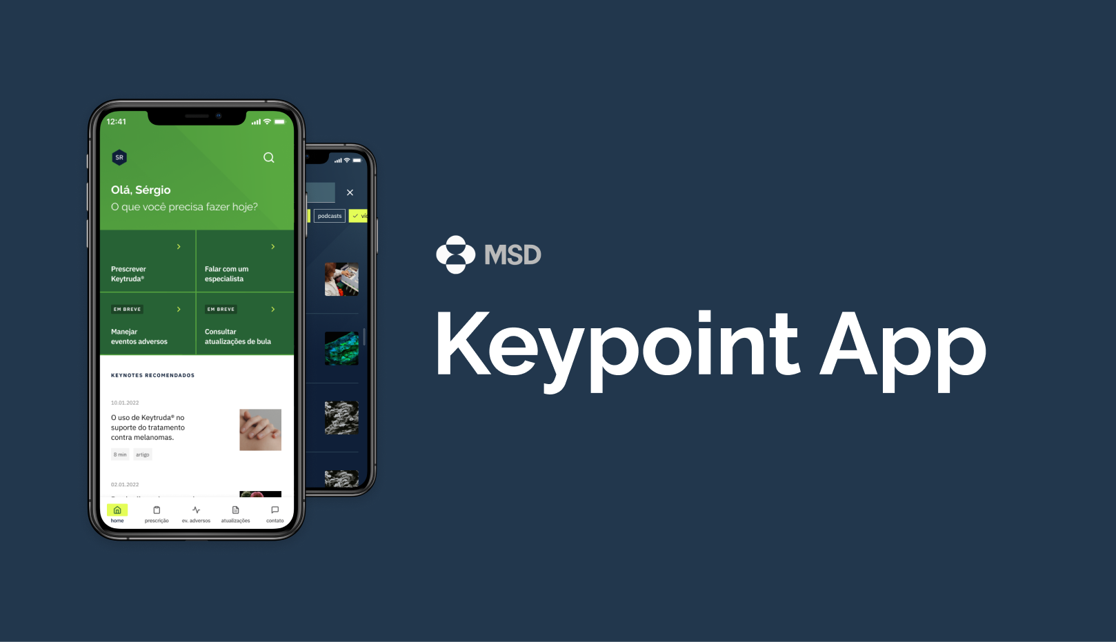
Keypoint is a mobile application developed for MSD, focused on supporting physicians who prescribe Keytruda, an immunotherapy treatment widely used in oncology.
As a Senior Product Designer, I was responsible for the end-to-end design of the application, from structure definition to final interface delivery.
The goal was simple in theory but critical in practice: give physicians fast, reliable access to essential drug information during patient consultations.
In healthcare, clarity is not aesthetic. It is safety.
The context
Keytruda is a complex immunotherapy drug with detailed administration protocols, contraindications, adverse reactions, and interaction risks.
Physicians needed to access:
- Dosage information
- Administration guidelines
- Adverse effects
- Drug interactions
- Contraindications
Existing materials were fragmented across PDFs, printed materials, and internal systems. None were optimized for quick mobile access during live consultations.
The opportunity was to transform static regulatory content into an intuitive clinical tool.
The problem
Oncologists operate under time pressure. During consultations, they cannot navigate dense documents or poorly structured systems.
The core challenge: How might we structure complex pharmaceutical information into a fast, scannable, mobile-first experience without compromising regulatory integrity?
The solution had to balance:
- Medical precision
- Brand presence
- Regulatory compliance
- Speed of access
- Cognitive clarity
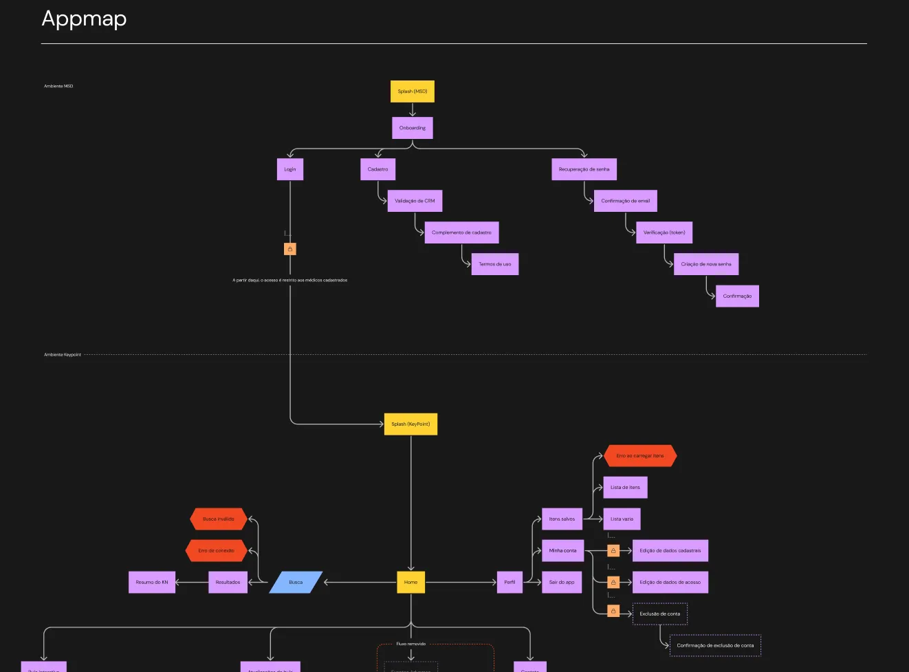
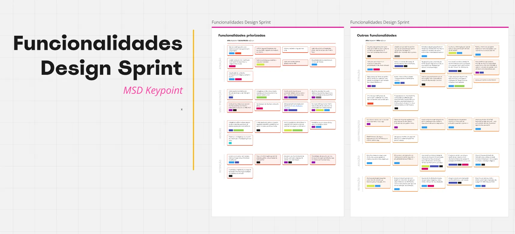
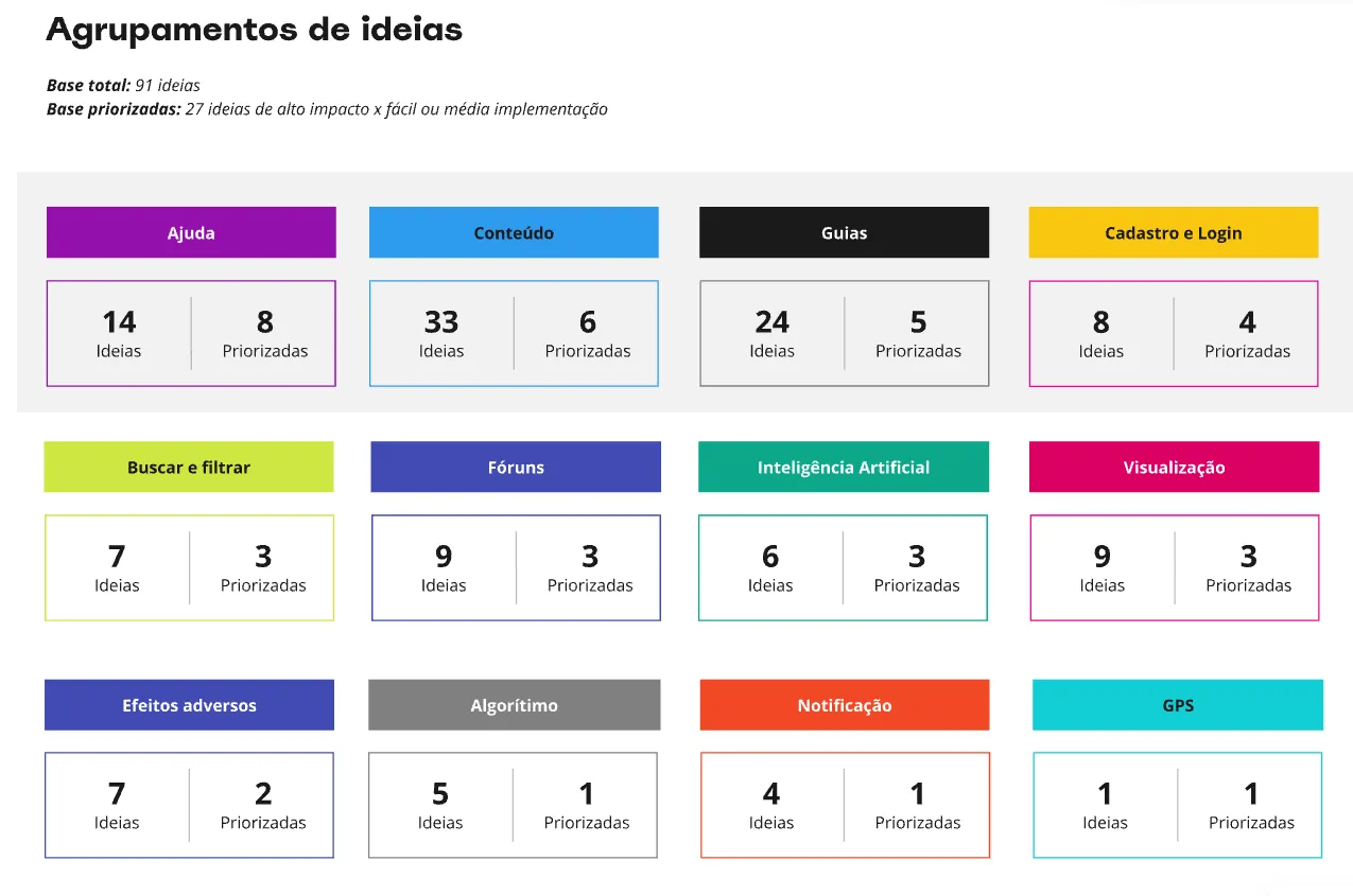
Defining the structure
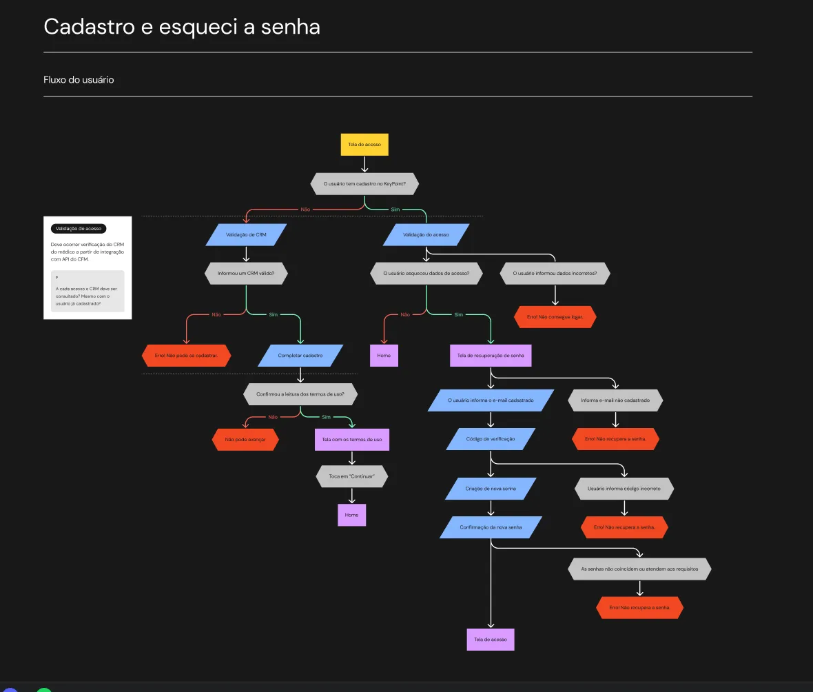
Instead of mirroring internal documentation categories, the navigation was organized around physician questions:
- What is the correct dosage?
- How should it be administered?
- What are the risks?
- Are there contraindications?
- Are there drug interactions?
This shift reduced cognitive load and aligned navigation with real consultation scenarios.
Designing for time pressure
Key principles applied
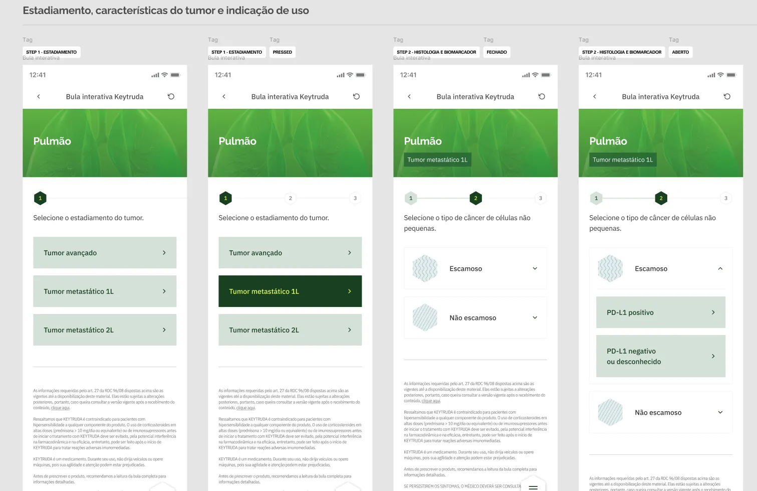
- Hierarchical clarity: Clear typography contrast, structured spacing, and modular sections allow physicians to scan content in seconds.
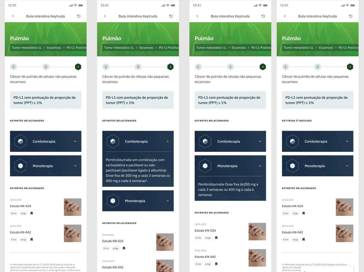
- Progressive disclosure: Information layers were structured to show only what is necessary first, with deeper levels available when needed.
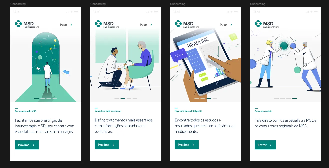
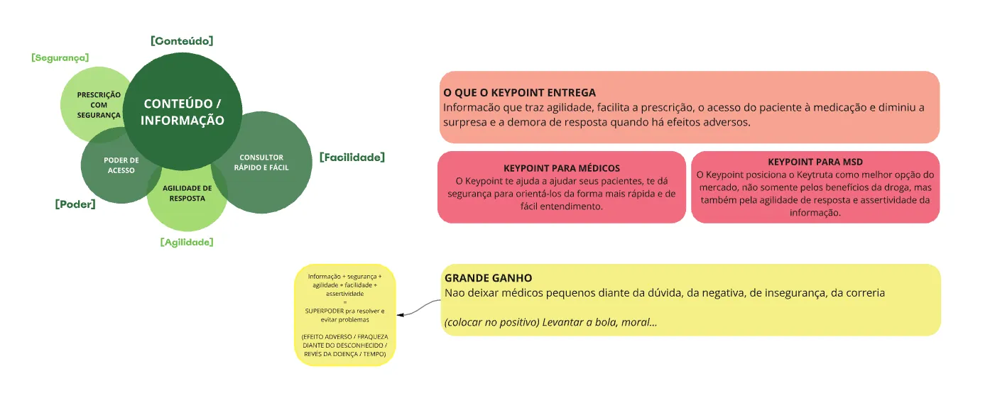
- Brand without noise: MSD brand presence was maintained through color and visual identity, but medical readability always took priority.
The interface needed to feel trustworthy, not promotional.
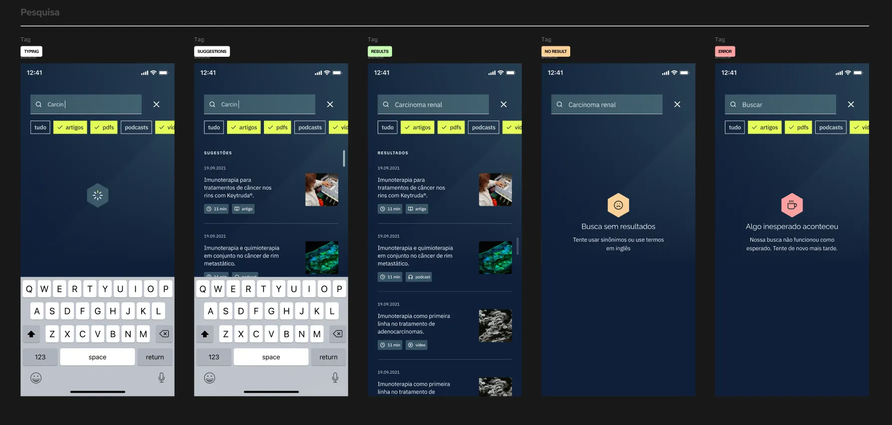
Transforming dense medical content
Simplification through structure
Pharmaceutical content is inherently dense and legally sensitive. Simplification could not mean omission.
To address this:
- Complex tables were reformatted for mobile readability
- Critical warnings were visually distinguished
- Sections were segmented into scannable blocks
- Terminology remained intact to preserve clinical accuracy
The content stayed complete. Access got simpler.
Interaction and usability
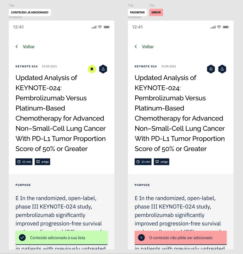
Micro-UX decisions
- Large tap targets for fast interaction
- Expandable content blocks to reduce scrolling fatigue
- Clear back navigation to avoid losing context
- Logical grouping to prevent information overload
Every interaction was designed assuming the physician is multitasking.
Visual consistency and system thinking
Scalable design system
Although delivered as a single product, the application was structured as a scalable system:
- Reusable components
- Consistent layout logic
- Modular content sections
- Standardized visual indicators for warnings and critical information
This ensures the product can evolve as drug information updates over time.
In pharmaceutical environments, change is constant. The design had to support that reality.

Constraints and trade-offs
This project required balancing:
- Strict pharmaceutical regulatory requirements
- Brand compliance from MSD
- Clinical precision
- Mobile usability
Not all ideal UX simplifications were possible due to compliance. Instead, the solution focused on clarity through structure and hierarchy rather than content reduction.
Outcome
The final product delivered a centralized mobile experience covering:
- Dosage
- Administration
- Adverse effects
- Drug interactions
- Contraindications
The application transformed static documentation into a consultation-ready clinical tool.
More importantly, it demonstrated how UX can operate in highly regulated environments without losing usability quality.
My role
Senior Product Designer
End-to-end responsibility:
- Information architecture
- UX strategy
- Interaction design
- Visual design
- Final delivery
This project strengthened my ability to design in complex, regulated industries where clarity directly impacts real-world outcomes.
Results
- Up to 30%
- less time to find drug information
- 1 tool
- replacing scattered PDFs and printed material